Problems related to Data Interpretation: Problems with Solutions
Data interpretation in mathematics is the process of understanding, analyzing, and calculating required values from given data where data can be of different formats like bar graphs, pie charts, histograms, table data etc. In this article, we are going to discuss ‘data interpretation problems’, ‘data interpretation problems with pdf’, ‘problems on data interpretation’, ‘table problems in data interpretation’, ‘data interpretation problems with solutions’ etc.
CAT 2024: 20 Free Mock Test | 10 Year PYQs | 60 Day Study Material | Most Scoring Concepts
XAT 2025: Section-wise Preparation Tips | Sample Paper
Don't Miss: SNAP 2024 Sample Papers | NMAT 2024 Sample Papers | MAT 2024 Sample Papers
Data Interpretation: Overview
Data interpretation makes analyzing data very simple and easy to understand. With data interpretation, we can understand and find the required value of any query related to bar graphs, pie charts, histograms, table charts etc quite easily.
Concepts required to solve the questions based on data interpretation
To solve data interpretation questions, we need to learn about some concepts first.
Basic arithmetic and algebra: Basic arithmetic operations like addition, subtraction, multiplication, and division are useful to solve data interpretation questions. We also need to understand basic algebraic formulae.
Percentages and Ratios: To compare and analyze data, we need to learn about percentages and ratios.
Most of the pie chart questions involve either percentages or ratios.
Average: After understanding the dataset, to answer the given questions, we need to learn about mean, median, and mode.
Graphs and Charts: We need to learn about graphs and charts to identify which is which data interpretation problem and when to use those graphs or charts.
Tabular form: Data given in tabular forms need to be understood carefully. We need to analyze headings, levels, and arrangement of data.
Statistics: We need to have basic knowledge of statistical measures such as variance, standard deviation, and correlation to solve these problems.
Conclusion: The conclusion of a data interpretation set is very important because it will be the explanation of the whole data. Decisions will be dependent on this conclusion.
Mental calculations: It is very important to do mental calculations to solve data interpretation problems in competitive exams to save time.
Practice questions based on the Bar graph
Q.1.
The following bar graph shows the production of jute, cotton, silk, polyester, and khadi in Companies A, B, and C.
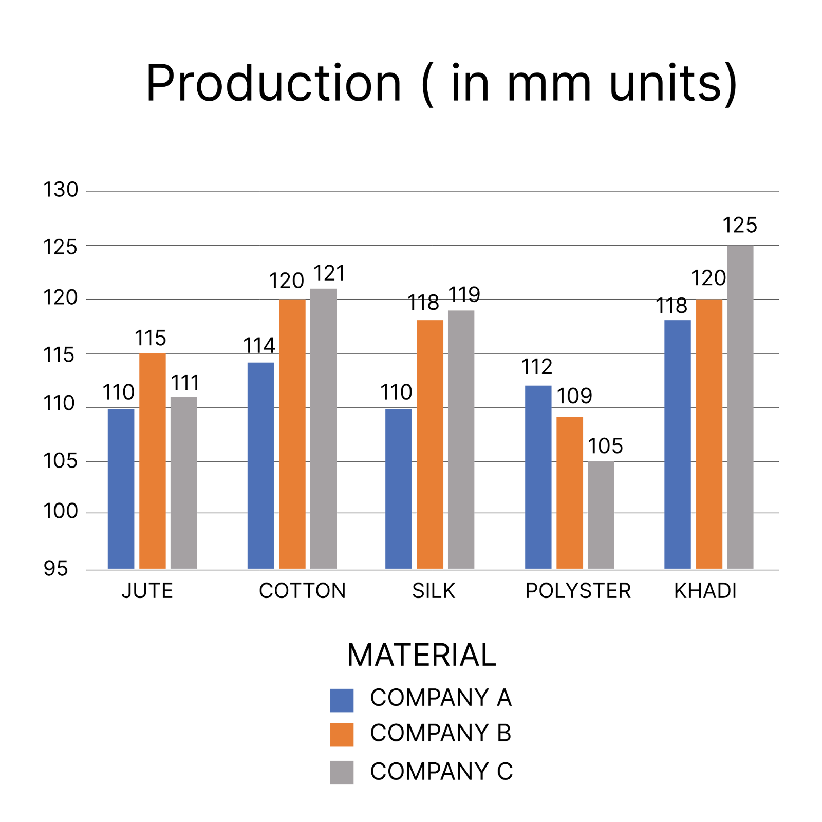
What is the difference between the total production of Cotton and Khadi?
Solution:
Total production of cotton by all the companies = 114 + 120 + 121 = 355
Total production of Khadi by all the companies = 118 + 120 + 125 = 363
Difference between the two = 363 – 355 = 8
Hence, the correct answer is 8.
Q.2.
The following bar diagram shows the number of students who opted for different subjects in the year 2020 and 2021.
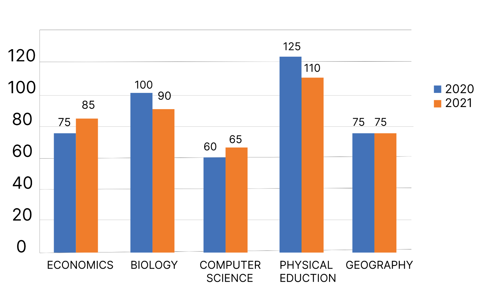
Out of all 5 subjects, what percentage (rounded up to two decimal places) of students opted for Biology in 2021?
Solution:
Number of students who opted for biology in 2021 = 90
Number of students opting for other subjects in 2021 = 85 + 65 + 110 + 75 = 335
Total number of students = 335 + 90 = 425
$\therefore$ Percentage of students opting for biology = $\frac{90}{425}\times100$ = 21.18%
Hence, the correct answer is 21.18%.
Practice questions based on the line graph
Q.1.
Study the following graph and answer the question.
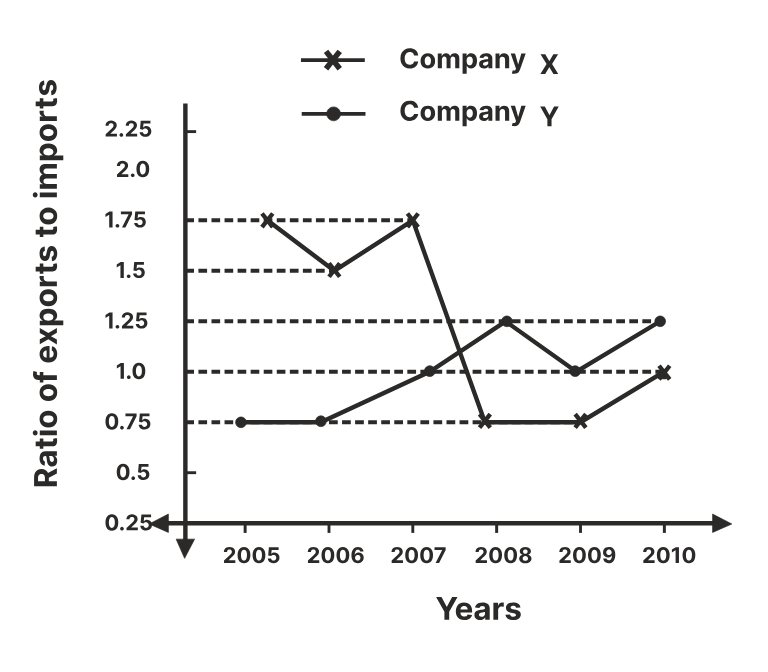
If the imports of company X in 2007 were increased by 40%, what would be the ratio of exports to the increased imports?
Solution:
As per the given graph,
Let the exports and imports of company X in 2007 as $x$ and $y$.
$⇒x = 1.75y$
The imports of company X in 2007 were increased by 40%.
The new imports of company X in 2007 after the increase of 40% = $(1+\frac{40}{100})y=1.4y$
$\therefore$ The required ratio $=\frac{x}{1.4y}=\frac{1.75y}{1.4y}=1.25$
Hence, the correct answer is 1.25.
Q.2.
The marks obtained by 273 examinees are shown by the frequency polygon. Given that the mean mark is 59.5. Study the frequency polygon and answer the given questions.
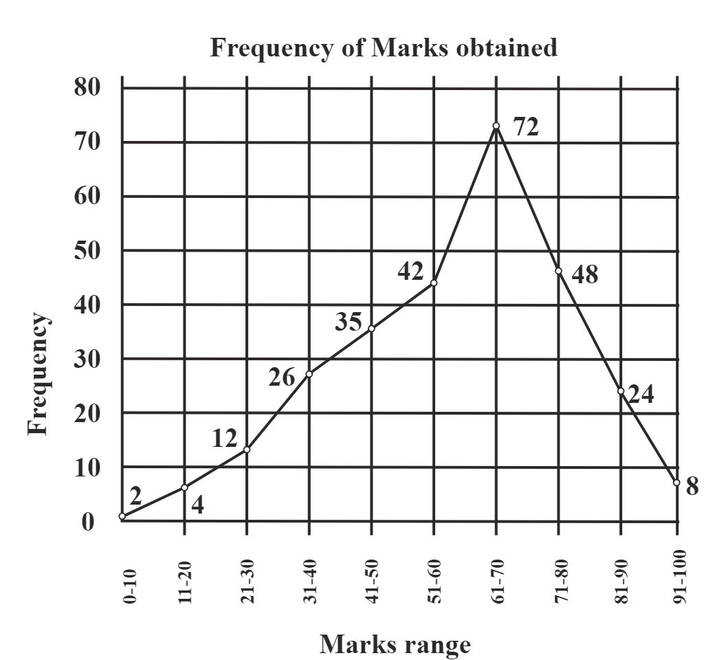
The percentage of the students who get above 80% marks is:
Solution:
As per the given graph,
The number of students who got above 80% marks = 24 + 8 = 32
The total number of students = 273
$\therefore$ The required percentage
$=\frac{\text{The number of students who got above 80% marks}}{\operatorname{The total number of students}} × 100=\frac{32}{273} × 100 = 11.72\%$
Hence, the correct answer is 11.72.
Practice questions based on the Pie chart
Q.1.
The given chart shows the marks scored by a class X student in different subjects (Values are in Degrees).
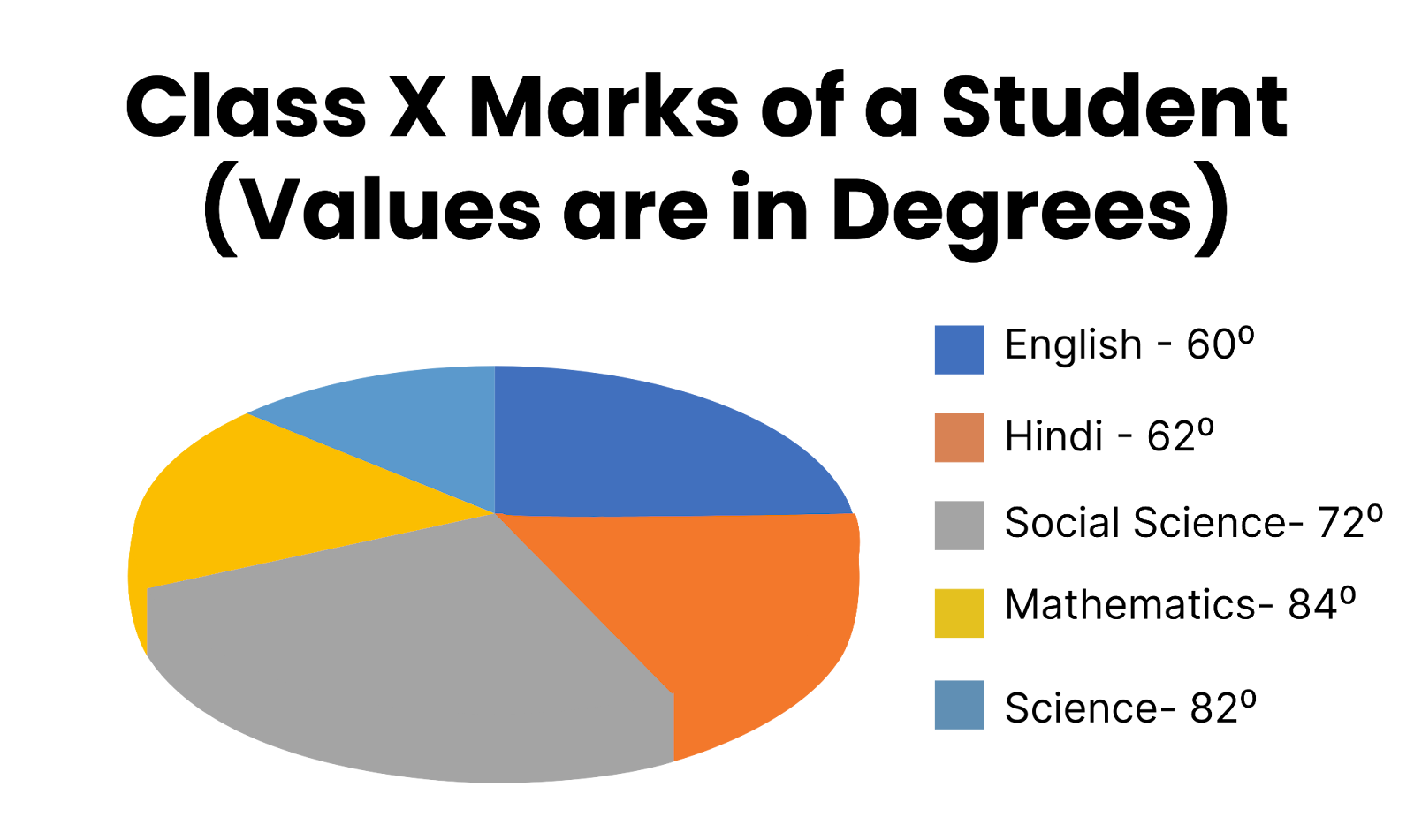
If the total marks are 1800, find the marks in social science.
Solution:
Given: The marks scored by Class X in different subjects (Values are in Degrees) is (60° + 62° + 72°+ 84° + 82°) = 360°
Total marks across subjects is 1800.
So, 1° $=$ $\frac{1800}{360°}=5$ marks
Hence, the marks in Social Science are 5 × 72 = 360 marks
Hence, the correct answer is 360.
Q.2.
The following pie charts show the data of the number of students who appeared and passed class 12 in sections A, B, C, D, and E.
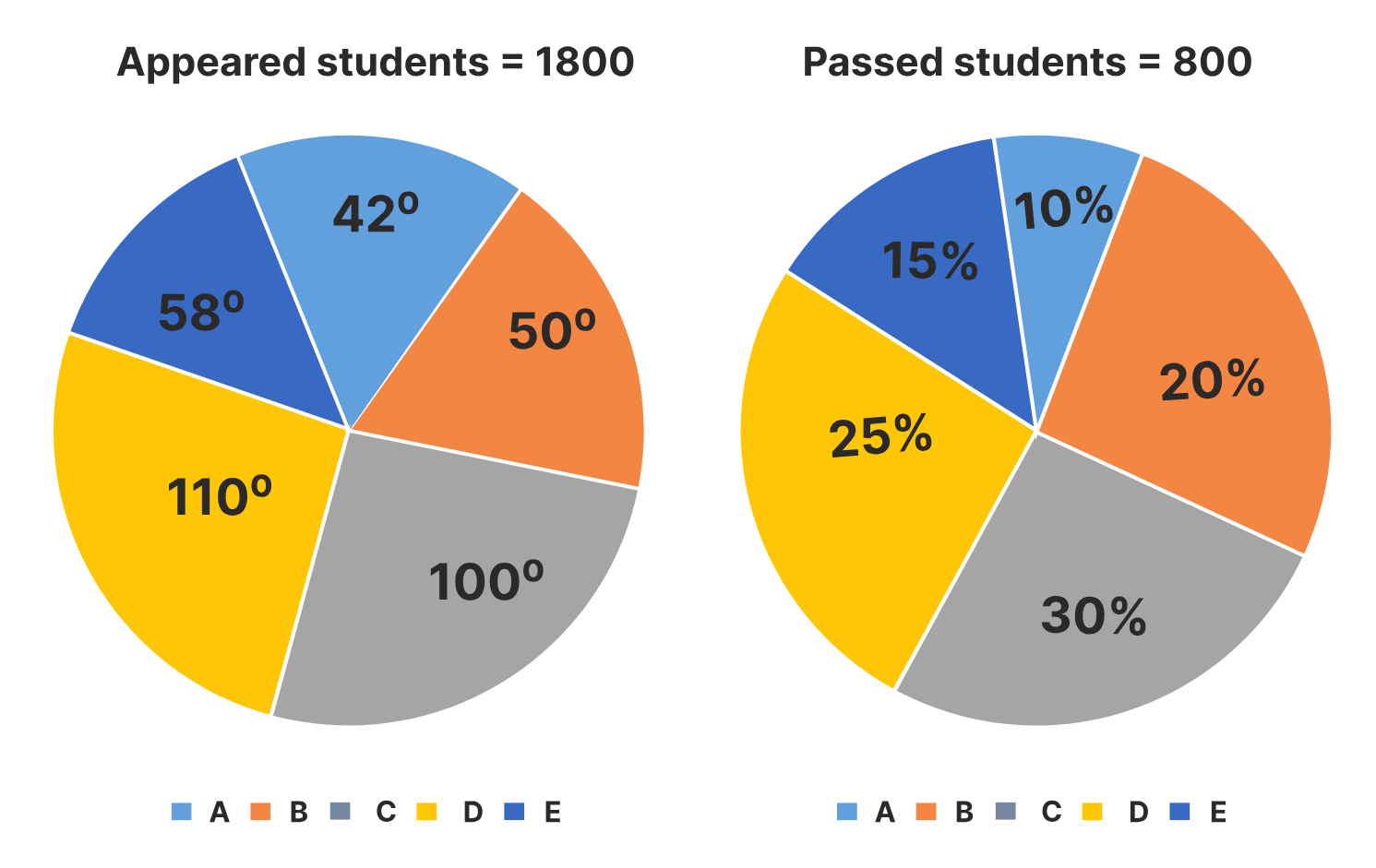
Find the difference between the number of students who appeared for the exam in sections A and B.
Solution:
Number of students who appeared for the exam in section A = 42°
Number of students who appeared for the exam in section B = 50°
Difference between the number of students who appeared for the exams in sections A and B = 8°
In the pie chart, the difference between the number of students who appeared for sections A and B
$=\frac{8}{360} \times 1800 = 40$
Hence, the correct answer is 40.
Practice questions based on Tabular DI
Q.1.
Study the given table and answer the question that follows.
The table shows the number of students studying in six different classes at six different schools.
School | Class V | Class VI | Class VII | Class VIII | Class IX | Class X |
P | 152 | 160 | 145 | 156 | 147 | 144 |
Q | 148 | 166 | 150 | 155 | 157 | 143 |
R | 161 | 152 | 140 | 145 | 143 | 165 |
S | 159 | 142 | 149 | 140 | 142 | 168 |
T | 147 | 144 | 158 | 163 | 154 | 150 |
U | 150 | 160 | 162 | 160 | 161 | 140 |
Total | 917 | 924 | 904 | 919 | 904 | 910 |
What is the respective ratio of students studying in class IX of schools Q and R together to those studying in class VI of schools S and T together?
Solution:
Number of students studying in class IX of schools Q and R = 157 + 143 = 300
Number of students studying in class VI of schools S and T = 142 + 144 = 286
The ratio of class IX students in Q and R to class VI students in S and $=\frac{300}{286} = \frac{150}{143} = 150:143$
Hence, the correct answer is 150 : 143.
Q.2.
Study the table and answer the question. The number of five types of cycles manufactured by a company over the years is given below:
Years | Types of cycles (in 1000) | ||||
| A | B | C | D | E |
1997 | 200 | 150 | 78 | 90 | 65 |
1998 | 150 | 180 | 100 | 105 | 70 |
1999 | 180 | 175 | 92 | 110 | 85 |
2000 | 195 | 160 | 120 | 125 | 75 |
2001 | 220 | 185 | 130 | 135 | 80 |
What was the approximate percentage increase in production of the D type of the cycle from 1998 to 2000?
Solution:
Production of the D type of the cycle in 1998 = 105
Production of the D type of the cycle in 2000 = 125
Increase in production of the D type of the cycle from 1998 to 2000 = 125 – 105 = 20
Percentage increase = $\frac{20×100}{105}$ = 19.05%
The approximate percentage increase in production of the D type of the cycle from 1998 to 2000 is 19%.
Hence, the correct answer is 19.
Practice questions based on Histogram
Study the following histogram of marks in mathematics (out of 50) of students in a class and answer the following question.
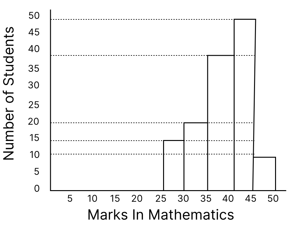
If the passing marks in math are 31, the number of students who failed in math is:
Solution:
The passing marks are 31, and students who failed are those who scored less than 31.
The number of students who failed was 15 and they scored between 25 and 30.
Hence, the correct answer is 15.
Practice questions based on the Spider graph
The following diagram shows the sales(in crores) of two companies A and B operating in the same industry during 2008-2013.
What is the total sales of both the companies combined in 2012?
Solution:
Sale of company A in 2012 = 40 crores
Sale of company B in 2012 = 60 crores
So, the total sale by both the companies in 2012 = (40 + 60) = 100 crores.
Hence, the correct answer is 100 crores.
Practice questions based on Caselet
In a batch of 60 students, 50% of the students scored more than 80% and 70% scored more than 50% in a test. There were 10% of students who scored less than 15 on that test. How many students scored between 15 to 60 marks if the total marks were 75?
Solution:
From this caselet, it is important to extract the necessary data first. If the total were 75, 80% of that would be $\frac{80}{100}$ × 75 = 60
Now, calculating the total number of students who scored less than 60 but more than 15 will give the total number of students who scored between 15-60 marks.
Here, the data “70% score more than 50%” can be ignored.
Therefore,
Students who scored more than 60 = 50% of 60 = 30 —–(i)
Students who scored less than or equal to 60 = 30 ——(ii)
Students who secured less than 15 = 6 ——(iii)
Now, students who score between 15 to 60 can be easily obtained by subtracting equations (ii) and (iii).
Therefore, the number of students scoring between 15 to 60 marks = (30 – 6) = 24.
Hence, the correct answer is 24.
Practice questions based on the Combination of two or more graphs
Q.1.
Read the pie chart and table carefully and answer the given questions.
The Pie chart shows the percentage distributions of the total number of laptops (both Dell and HP) sold by six stores in March.
Total number =11200
The ratio of the number of Dell and HP sold | |
Stores | Ratio |
A | 5 : 4 |
B | 7 : 6 |
C | 1 : 4 |
D | 11 : 10 |
E | 4 : 3 |
F | 3 : 1 |
What is the average of Dell laptops sold by stores A, C, D, and E together?
Solution:
Total number =11200
Total number of laptops sold by A = 18% of 11200 = $\frac{18}{100}\times 11200$ = 2016
⇒ Dell laptops sold by store A = $\frac{5}{5+4}\times 2016$ = 1120
Total number of laptops sold by C = 20% of 11200 = $\frac{20}{100}\times 11200$ = 2240
⇒ Dell laptops sold by store C = $\frac{1}{1+4}\times 2240$ = 448
Total number of laptops sold by D = 12% of 11200 = $\frac{12}{100}\times 11200$ = 1344
⇒ Dell laptops sold by store D = $\frac{11}{11+10}\times 1344$ = 704
Total number of laptops sold by E = 14% of 11200 = $\frac{14}{100}\times 11200$ = 1568
⇒ Dell laptops sold by store E = $\frac{4}{4+3}\times 1568$ = 896
⇒ Average = $\frac{1120+448+704+896}{4}=\frac{3168}{4} $= 792
Hence, the correct answer is 792.
Q.2.
Study the given graph and table and answer the following question. Data of different states regarding the population of states in the year 1998.
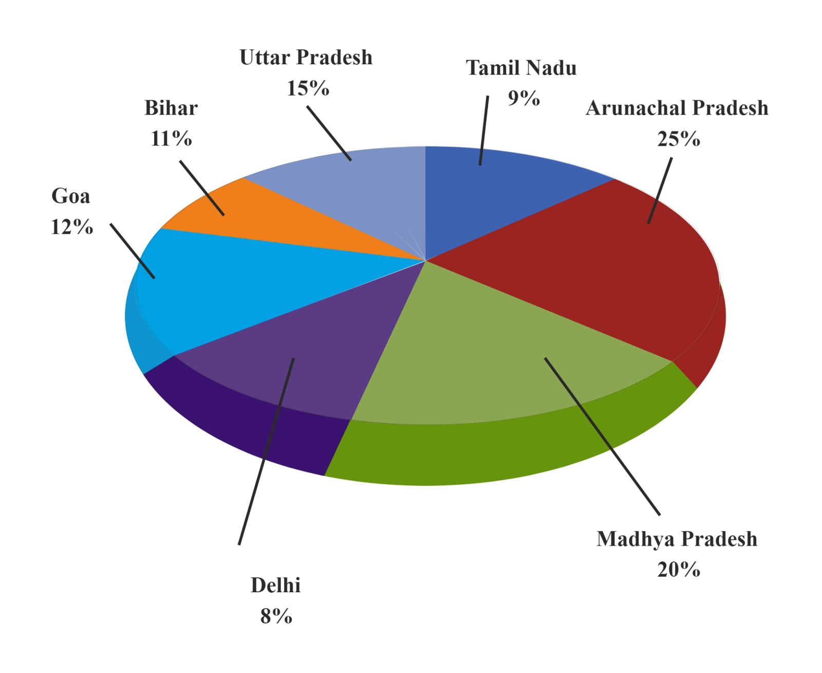
States | Sex and literacy wise Population Ratio | |||
Sex | Literacy | |||
M | F | Literate | Illiterate | |
Arunachal Pradesh | 5 | 3 | 2 | 7 |
Madhya Pradesh | 3 | 1 | 1 | 4 |
Delhi | 2 | 3 | 2 | 1 |
Goa | 3 | 5 | 3 | 2 |
Bihar | 3 | 4 | 4 | 1 |
Utter Pradesh | 3 | 2 | 7 | 2 |
Tamil Nadu | 3 | 4 | 9 | 4 |
If in the year 1998, there was an increase of 20% in the population of Goa and 10% in the population of Arunachal Pradesh compared to the previous year, then what was the ratio of the population of Goa and Arunachal Pradesh in 1997?
Solution:
The population of Goa in the year 1998 = $32760000 \times \frac{12}{100}$
= 3931200
Population of Goa in the year 1997 = $3931200 \times \frac{100}{120}$
= 3276000
Population of Arunachal Pradesh in the year 1998 = $32760000 \times \frac{25}{100}$
= 8190000
Population of Arunachal Pradesh in the year 1997 = $8190000 \times \frac{100}{110}$
= $\frac{81900000}{11}$
Ratio = $3276000 : \frac{81900000}{11} = 11 : 25$
Hence, the correct answer is 11 : 25.
Important points
Check the given data carefully before calculation.
Always check the units of the given data.
Keep an eye out for some patterns in the provided data.
Always use the appropriate formula for that specific problem.
To improve speed and accuracy, we just have to practice many types of problems daily.
Frequently Asked Questions (FAQs)
A bar graph is one type of visual data where we represent data through rectangular bars, in which two parameters are given in the two axes (x-axis and y-axis). These bars can be of any size, and can be horizontal or vertical also every bar represents a different category of the given data and the length of the bar represents its value.
A pie chart is one type of circular chart which is divided into multiple sectors where each sector represents a different category. The central angle of each sector represents the value of the given category.
Data interpretation is a method of getting useful information from a given dataset presented by graphs, charts or tables. The main goal of data interpretation is to analyse the given data to reach necessary conclusions.
Data interpretation is very important for analysing and interpreting data in a table or graph form.
Data interpretation is crucial for making informed decisions in business, research, and everyday life. Accurate interpretation can lead to better choices and strategies.
It can be used to predict upcoming trends and future competition.
It helps us gain knowledge and develop a competitive strategy.
To validate hypotheses and in research fields, data interpretation is very useful.
It gives us insight into complex issues to solve them easily.
A histogram is one type of graph that represents the frequency distribution of continuous classes. It is a set of rectangles whose base covers the class intervals and the area of the rectangles represents the frequency of the variables. The rectangles in the histogram are adjacent to each other as their bases cover the boundaries of class intervals.
Articles
Download Careers360 App's
Regular exam updates, QnA, Predictors, College Applications & E-books now on your Mobile

300M+
Students

36,000+
Colleges

550+
Exams

1500+
E-Books

16000+
Certifications
