Gestalt Theory : Principles of Design
Design principles are the initial and basic or fundamental ideas which can be employed when developing aesthetics and effective design. Knowledge of these principles is crucial in conceptualization of appealing and easy-to-use interfaces that conveys concepts successfully. In graphic designing, product designing, or even architecture, it is very important for the beginners or the newcomers into the designing industry to understand the principles of design. Since Design principles is the foundation of all concepts in visual language and design, it becomes important that candidates for NID and UCEED learn about it.
This Story also Contains
- Five Important Principles of Design:
- Product Design:
- Good Graphic Design: Design Principles
- Gestalt’s Law
- Conclusion

Five Important Principles of Design:
- Balance
- Rhythm
- Movement
- Emphasis
- Harmony
Let’s understand and acknowledge them;
Balance -
The distribution of visual weight in a design, ensuring that no single element overpowers another, creating a sense of stability and equilibrium. For example, below, there is a blue triangle, which is visually balanced by three red triangles; this way visual weight is managed.
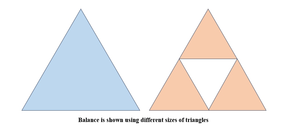
Types of Balance:
1. Symmetrical Balance: Equal elements on both sides, like a mirror reflection.
2. Asymmetrical Balance: Unequal elements are balanced by size, color, and placement.
3. Radial Balance: Elements like a wheel radiate from a central point.
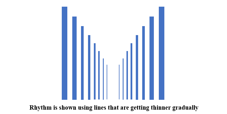
Rhythm -
The repeated elements in a controlled and organized way, leading the viewer's eye through the design in a harmonious flow. For example, below, you can see the blue lines getting thin and far, which gives a feeling of flow and rhythm, just like in music and dance.
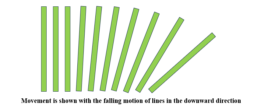
Movement -
The viewer’s eye across the design creates a sense of motion and directs attention to critical elements through strategic placement and use of lines. For example, below the green lines, we are about to fall; this gives a feeling of movement that leads our eyes in some direction of movement.
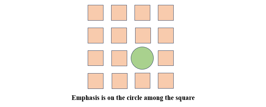
Emphasis -
The most essential parts of a design are making it stand out through contrast, color, or size, ensuring it captures the viewer's attention. For example, the red circle is seen below, followed by the blue square around it because the red circle is different in shape, size, and colour than the blue squares.
Harmony -
The cohesive blending of elements to create a unified and aesthetically pleasing design, where all components work together seamlessly without conflict. For example, below, multiple circles are different in size and color but are all placed together to look pleasing and soothing to our eyes.

Understanding of Design Principles for Good Design
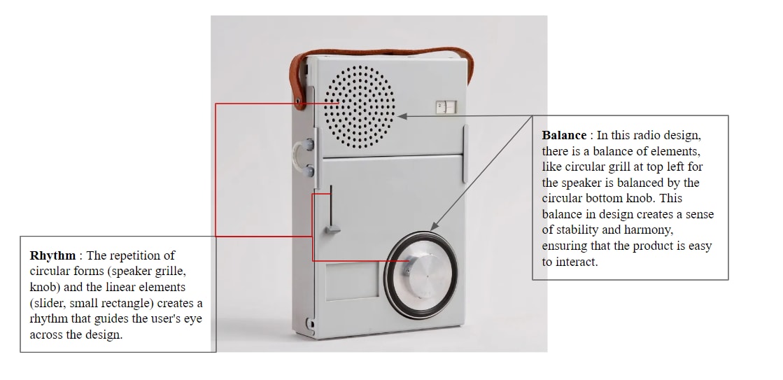
Let’s understand the concept with an example through, TP 1 radio/phono combination, 1959, designed by Dieter Rams for Braun.
Product Design:
Design Principles for Braun Radio: From the work presented by Dieter Rams, he created objects that were not only functional but also visually appealing, in addition to being functional and easy to use. Concerning harmony, movement, balance, rhythm, and accent, Rams saw to it that every design was optimized for the purpose it was intended but had that minimalist, modern design. Because he has a strong knowledge of design, he provides Braun with creative and sustainable designs.
This looks like a perfect design; it is reliable in terms of usability and also aesthetic durability and has a timeless appeal as can be evidenced from the pictured product.
Good Graphic Design: Design Principles
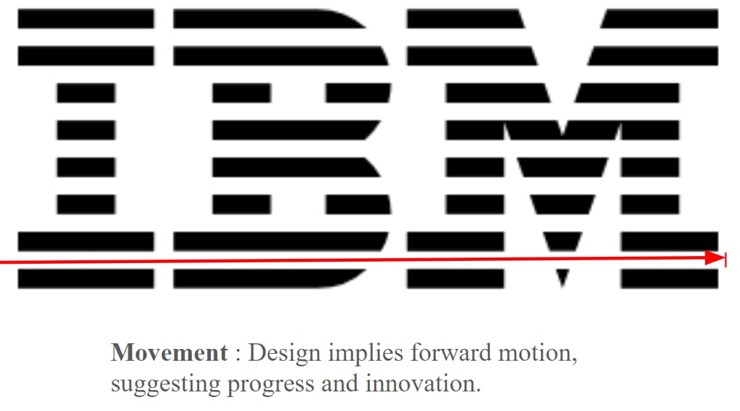
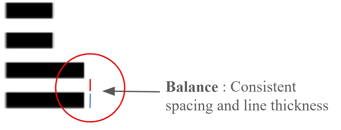
Let’s Explore the Design principles in Paul Rand’s IBM Logo Design

You may also check:
These are some of the topics that are generally also asked in DAT exams. Students can go through for their design entrance exam preparations.
Gestalt’s Law
Gestalt’s Law, which states that a whole is perceived rather than the sum of its parts. These includes Proximity, Similarity, Closure, and Continuity are laws that explain how we sort information visually as well as how we make meaning of such images. Many laws play an important role in design, as it helps in constructing the easily digestible images which form the basis of most of the visually appealing compositions, and thus helps in shaping the easily comprehensible experiences.
Let’s understand the following laws with example:
Closure
Closure is the Gestalt principle where the human mind fills in missing parts of a design to perceive a complete, unified shape, even when it's incomplete.
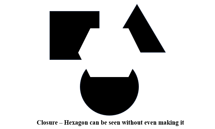
For example, there are squares, triangles and circles below, and we can see hexagons between them without being drawn.
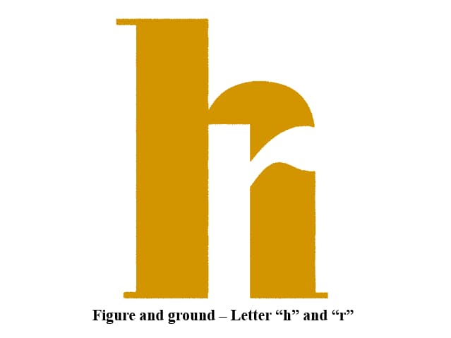
Figure and Ground
The Figure and Ground principle explains how we distinguish objects (figures) from their surrounding background (ground), creating a sense of depth and focus in design. For example, the letters “h” and “r” can be seen, but it depends on the viewer what they perceive first; that becomes the figure, and the other becomes the ground.
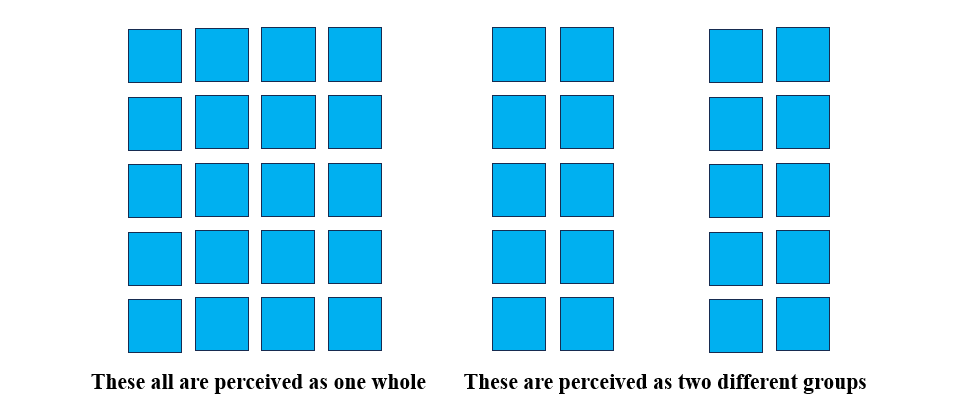
Proximity
Proximity refers to the grouping of elements based on their physical closeness to one another. Elements that are close together are perceived as related, forming a cohesive structure. For example the blue squares on the left are seen as one whole together because of their placement, whereas on the other hand there is a gap between which makes two separate groups on the right.
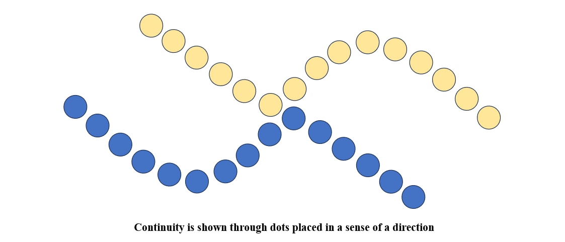
Continuity
Continuity is the principle where the eye naturally follows a path or line, leading it through a design in a smooth, flowing manner, creating a sense of movement and direction.
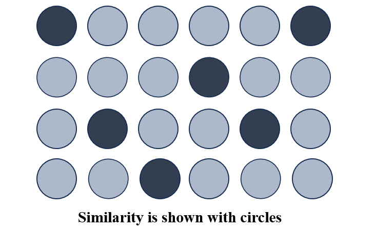
Similarity
The Gestalt principle of similarity states that elements that are similar in appearance are perceived as part of the same group or pattern, creating a sense of unity in design.
Best example to understand all the principles:
Book cover of “Peter and the Wolf” by Phoebe Morris
The Design Principles and Gestalt’s law, which are applied and kept into mind while making this;

Analysis of Book Cover by Gestalt Principles:
1. Figure and Ground: The figure is represented by the contours of the wolf’s image while the boy's silhouette creates the ground.
2. Closure: One fills in the missing details that a mere sketch of a boy was providing and a near complete person is formed in the mind.
3. Proximity: The head of the wolf and the bird are near each other, which suggests that they have communicated.
4. Continuity: Using a curve, one can easily follow the smooth line of the wolf across the whole design.
Design Principles:
1. Balance: This is asymmetrical balance since the light grey-colored wolf is large and is flanked by the darkness of the negative space surrounding it.
2. Emphasis: The placement of this title enhances the focus on the boy that has been created with the help of a negative space.
3. Contrast: A bright background also emphasizes the key features and main object, which is the dark-colored wolf.
4. Movement: This design makes the viewer’s eye move from the wolf’s head to the bird, providing continuity.
Conclusion
Knowledge and application of design principles are essential in designing any layout with suitable structure, appearance and functionality. These principles will be useful as a framework heading into the NID and UCEED and will be able to guide creativity and thought processes as well as helping articulate ideas. Learning balance, rhythm, emphasis and, most importantly, harmony will help you create designs that are attention-catching as well as informative. The above-stated skills will be very useful in your journey as a designer.
Sample Questions & Answers:
Q1: Why are Gestalt principles important in design?
Ans: They help designers create organized, visually appealing, and user-friendly designs that guide the viewer’s eye naturally.
Q2: How does proximity affect readability in design?
Ans: Grouping related elements together improves readability and makes the content easier to scan.
Q3: What is an example of closure in everyday design?
Ans: The "Coca-Cola" logo, which uses flowing letters that the brain naturally completes.
Q4: Why do brands use symmetry in logos?
Ans: Symmetrical logos look stable, professional, and aesthetically pleasing, which builds trust with consumers.
Frequently Asked Questions (FAQs)
Design principles are the main control norms that define the creation of beautiful and practical designs. Some of the aesthetic principles are balance, accentuation, and harmony. For NID and UCEED, knowledge of these principles is highly important since the entrance exam involves graphic design and the delivery of the idea.
The design principles should be learned separately, and a specific situation where a certain principles website is used properly should be chosen. Try to develop layouts using particular gleaned from this article, such as balance or emphasis arrangement.
Design principles form a base for creating good portfolio works and sketches which are important for NID and UCEED. Adding some principles such as rhythm and movement of the line, will add life to your sketches. Proportion and Areas will make your compositions more focused, and instead of overloading your designs with too many elements.
Gestalt’s Law, which states that a whole is perceived rather than the sum of its parts. These includes Proximity, Similarity, Closure, and Continuity are laws that explain how we sort information visually as well as how we make meaning of such images.
The repeated elements in a controlled and organized way, leading the viewer's eye through the design in a harmonious flow. For example, below, you can see the blue lines getting thin and far, which gives a feeling of flow and rhythm, just like in music and dance.