

Color Theory: Properties, Psychology, Question and Answer
Color theory is the study of understanding how various colors behave and affect one another. It also aids in comprehending how colors affect how people perceive things. The concepts of color mixing and the visual effects produced by particular color combinations are included in color theory. Creative professionals utilize color theory as a tool to create harmonious and aesthetically pleasing works of art. Understanding color psychology and theory is essential for effectively communicating emotions and concepts through visual media.
This Story also Contains
- Colour Wheel
- Color Harmonies
- Color Psychology
Color is given a logical framework by color theories. For instance, we can arrange a variety of commonplace objects we find around by color and arrange them on a circle to illustrate how the colors relate to one another.
Colour Wheel
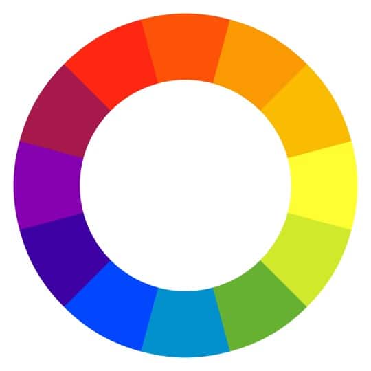
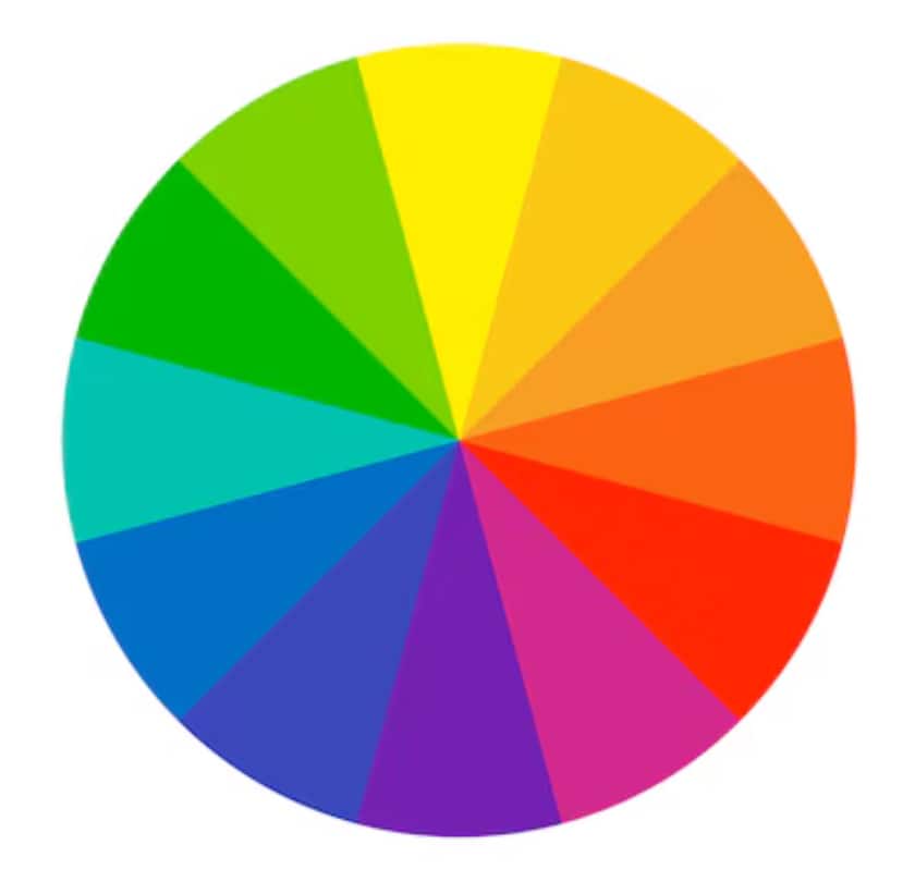
Color Wheel is a circular diagram to show how different colors are related. It provides a clear order for primary, secondary, & tertiary colors. Artists & Designers use this tool to understand color harmonies, combinations and make balanced designs. Color theory also helps for visualizing how different colors work together.
1666, Isaac Newton Modern Colour Wheel 1666
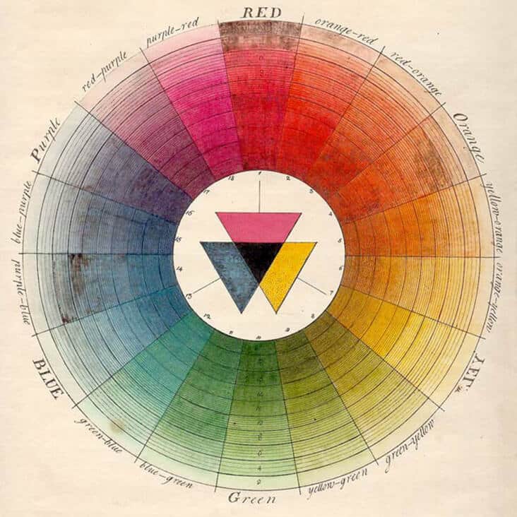
Isaac Newton invented the color wheel back in 1666. To show the connections between primary, secondary, and tertiary hues, he plotted colors into a circle. Newton's work, which depicted the visible light spectrum, served as the foundation for color theory.
Understanding the Color Wheel
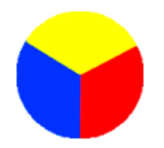
A color wheel typically has 12 colors. It includes primary, secondary, & tertiary colors.
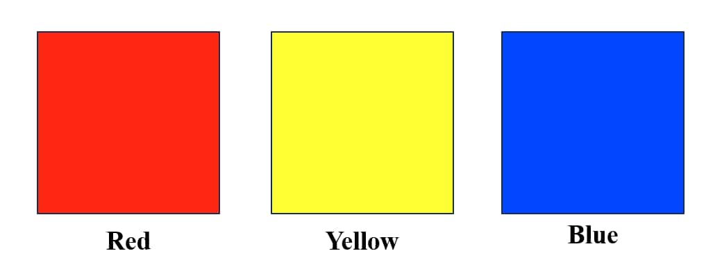
Primary Colors
These simple colors. You can't mix other colors to make them. On the traditional color wheel, the primary colors are red, yellow, & blue.
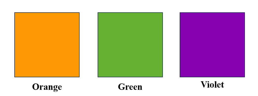
Secondary Colors
When you mix two primary colors, you get secondary colors. They are orange, green, & purple.
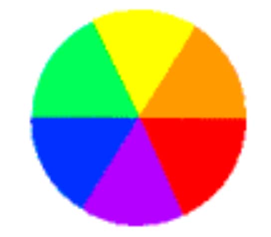
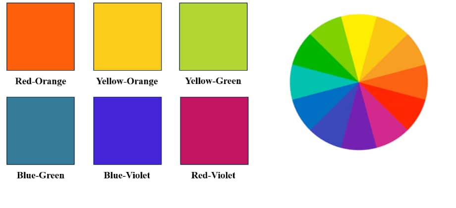
Tertiary Colors
These result when you mix a primary color with a secondary color that's next to it on the wheel. For example, mixing red & orange gives you red-orange.
You may also refer to:
Color Harmonies
Color harmonies refer to combinations of colors that look good together.
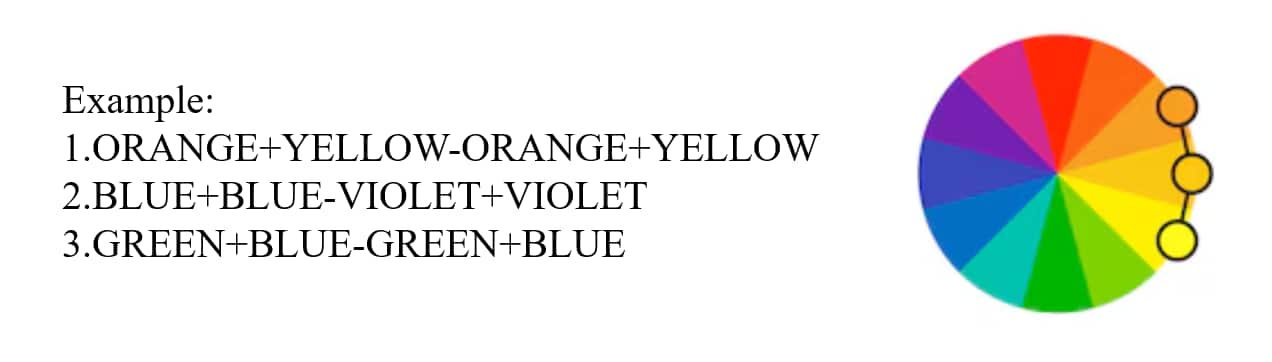
Analogous Colors: Analogous colors are colors that sit next to each other on the color wheel. They typically share a common color (like blue-green or red-orange) and have a similar hue, which gives them a natural, harmonious appearance.
Use in Design:
These color combinations are often used to create calm, soothing, and unified designs. The gentle transition between colors gives a sense of order and flow.
For example, shades of blue, blue-green, and green are all analogous. Using these in a design can create a serene atmosphere—perfect for designs meant to evoke peace and tranquility, such as spa websites or wellness brands.
Effect on Viewer:
Analogous color schemes are easy on the eyes and can promote a sense of comfort and relaxation.
Designers often use this scheme for background elements or to create a subtle color palette that feels cohesive without overwhelming the viewer.
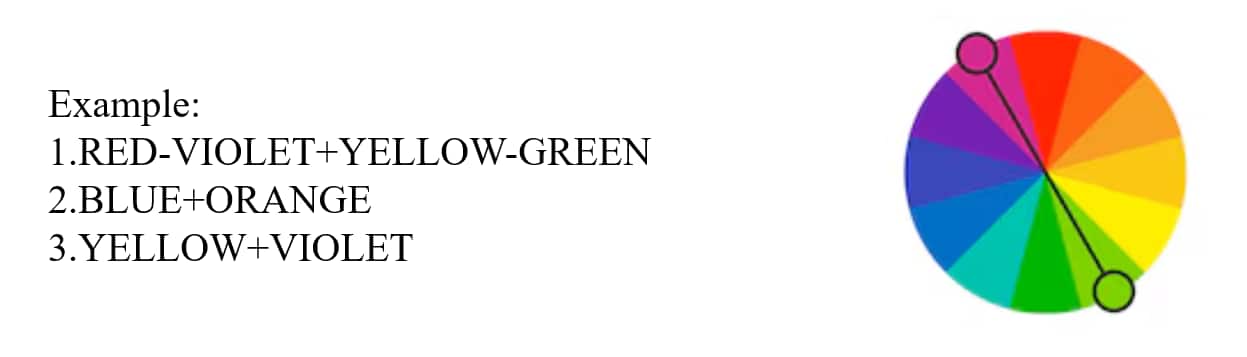
Complementary Colors: Complementary colors are those that are located directly opposite each other on the color wheel. Common complementary pairs include red and green, blue and orange, or yellow and purple.
Use in Design:
Complementary colors provide a high contrast and vibrant look, making them ideal for designs that need to stand out or catch attention. When placed next to each other, they create maximum contrast, making each color appear more intense.
They are often used in calls to action, advertisements, logos, or anywhere that requires high impact.
Effect on Viewer:
Complementary color schemes draw the viewer's attention because of their high contrast. However, they need to be used carefully to avoid visual chaos.
In some designs, one color is typically used in a dominant role, while the complementary color serves as an accent, balancing vibrancy with subtlety.
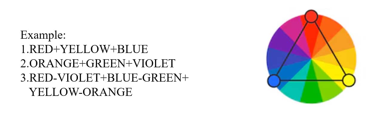
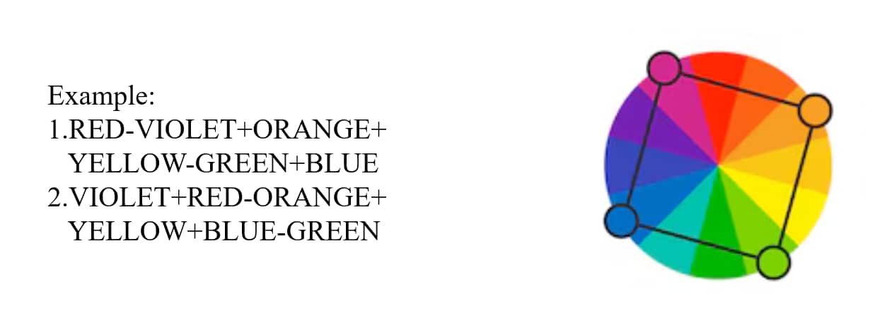
Tetradic Colors: Also known as double-complementary, this scheme uses two pairs of complementary colors. For example, red and green combined with blue and orange. This creates a rectangle on the color wheel.
Use in Design:
Tetradic color schemes are full of possibilities, offering a rich and diverse color palette. This can be particularly effective in creating designs that need a large variety of colors but still want to maintain balance and harmony.
It’s commonly used in art, interior design, and fashion, especially for designs that aim to be complex but visually pleasing.
Effect on Viewer:
With four colors, the tetradic scheme can be very dynamic and vibrant, but it can also become overwhelming if not used properly. Designers need to find a balance by using one color as the dominant hue and the others as supporting or accent colors.
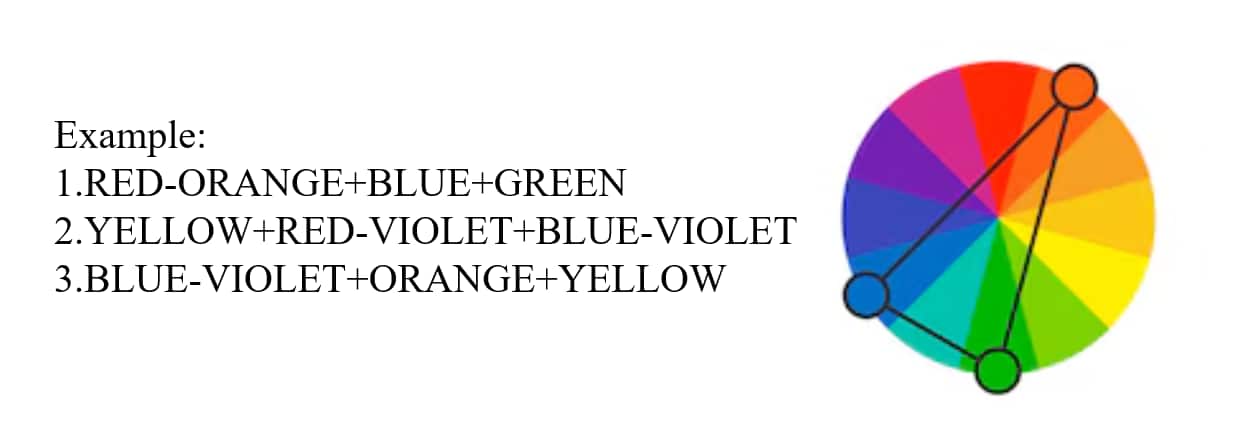
Split-Complementary Colors:This scheme uses one base color and two colors adjacent to its complementary color. For example, instead of using red and green (complementary), a split-complementary scheme might use red with yellow-green and blue-green.
Use in Design:
The split-complementary scheme provides a high contrast like complementary colors but with less tension. It’s a safer choice for creating vibrant designs without the overwhelming visual effect that can occur with direct complementary colors.
This color scheme works well for websites, advertisements, and artwork where designers want to highlight a primary color but still maintain a harmonious relationship with the other colors.
Effect on Viewer:
This creates a strong visual appeal without the high visual tension found in direct complementary schemes. It is versatile and often seen in modern graphic designs.
Tetradic Colors: Also known as double-complementary, this scheme uses two pairs of complementary colors. For example, red and green combined with blue and orange. This creates a rectangle on the color wheel.
Use in Design:
Tetradic color schemes are full of possibilities, offering a rich and diverse color palette. This can be particularly effective in creating designs that need a large variety of colors but still want to maintain balance and harmony.
It’s commonly used in art, interior design, and fashion, especially for designs that aim to be complex but visually pleasing.
Effect on Viewer:
With four colors, the tetradic scheme can be very dynamic and vibrant, but it can also become overwhelming if not used properly. Designers need to find a balance by using one color as the dominant hue and the others as supporting or accent colors.
You may also refer to:
Colour Properties
Hue: This is the name of a color, like or blue. It's the purest version of a color without mixing white or black.
Tint: When you add white to a color, you create a tint. This makes the color lighter.
Tone: A tone is made by mixing gray into a color. This softens how strong it looks.
Shade: You get a shade by adding black to a color. This darkens it.
Saturation: Indicates the color's level of purity or intensity. Elevated saturation level? The hue is vivid and bright. Diminished saturation? It is more subdued or toned.
Value: A color's lightness or darkness is indicated by this. A tint is created when a color and white are combined. Shade is produced by adding black.
Color Psychology
The study of how humans perceive and how human emotions and behaviors are influenced is called Color psychology. Certain hues for colors also affect particular psychological reactions in humans. Color psychology is also used by designers for color theory in graphic design and color theory in ui design for better visualizations.
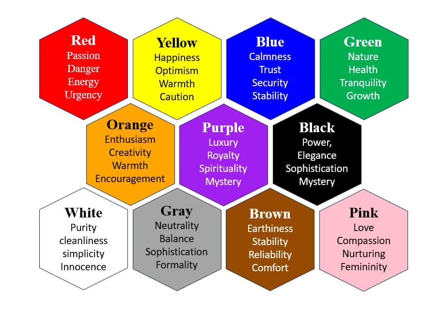
Design decisions taken by artists and designers in a variety of industries are influenced by color psychology. This is done so to explore how colors affect human behavior and emotions and therefore help in taking better decisions for visuals. This also explains how individual variances and cultural influences impact color perceptions as well as how color theory can be used practically in design industries.
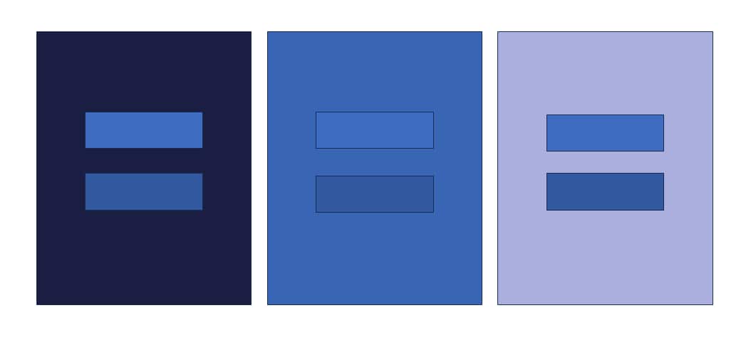
Color Interaction
The term "color interaction" describes how distinct hues interact with one another for the different alterations on perceptions of color and can also produce a variety of visual effects that will include vibrancy, contrast, and harmony.
Darker surrounding color –the central square appears lighter
Lighter surrounding color –the central square appears darker
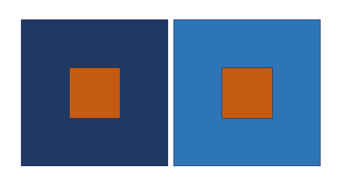
The perceived difference between two colors appears more distinct when they are surrounded by a third color.
You may also refer to:
Fundamentals of Geometry for 3D Shapes
Fundamental Geometry Concepts for 2D Shapes
Sample Questions:
Q. Fill the grid with colors according to the following themes.
Theme 01: Dawn Theme 02: Extrovert
*Hint - To solve this type of question first breakdown the meaning of Theme into keywords and then picking the color according to how they feel and express it.
Q. Look for a comparable combination on the color wheel using options (NID DAT 2024)
Yellow-Orange/Yellow/Yellow-Green
Red-Orange/Red/Magenta
Purple/Blue/Green
Yellow/Cyan/Orange
Frequently Asked Questions (FAQs)
Understanding color theory and psychology color theory in UI UX is essential for effectively conveying emotions and messages through visual media.
Color theory in graphic design helps in understanding the effect of colors on human perception. Color theory includes the principles on mixing of different colors and the visual effects provided by specific different color combinations.
Artists and designers use color theory to create aesthetically pleasing and harmonious works.
Color contrast in color theory is explained by the difference between different color hues.
Sir Isaac Newton created the first color wheel back in 1666. He mapped colors in a circle to highlight the links between primary, secondary, & tertiary hues.
The study of understanding on how different colors behave and influence each other is known as the Color theory.
