Typography: Meaning, Elements, Classification & Examples
Typography means the application of arts and techniques in arranging type for enhanced aesthetic and readability values of textual information. It is vital in the process of designing because it determines how the contents are viewed and, in turn, comprehended. For instance, the use of different forms of headline typeface is daring and trendy, while the use of the more straightforward typeface for the text body provides simplicity and legibility, respectively. Thus, it becomes crucial for the contender of NID and UCEED to learn about it as it is the building block of any concept in visual language and design.
- Elements of Typography
- Typography for Good Design
- Diverse Applications of Typography
- Important Sample Questions from NID/UCEED
Elements of Typography
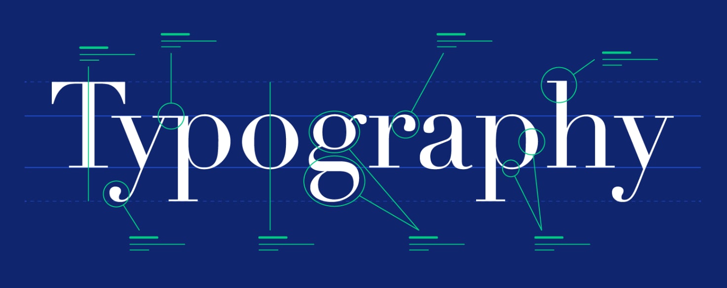
There are 06 elements of Typography Design which are covered in this article.
Typeface
Hierarchy
Alignment
Spacing
Contrast
Legibility
Now let’s try to understand each of them isolated through examples in illustrations.
1. Typefaces and Fonts:
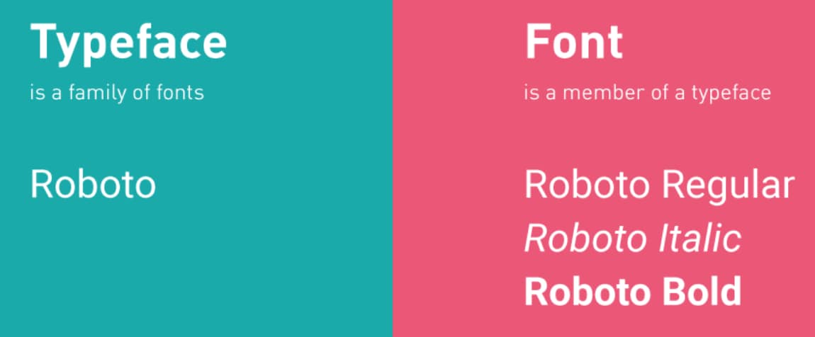
They are the mode and manner of the write up. Typography meaning can be explored through these elements as a typeface can be defined as an overall look and feel of a set of letters, numbers, and symbols, while a font is simply a sub-category within a typeface for instance, bold and italic.
Classification of Typeface: Serif Vs. Sans-Serif
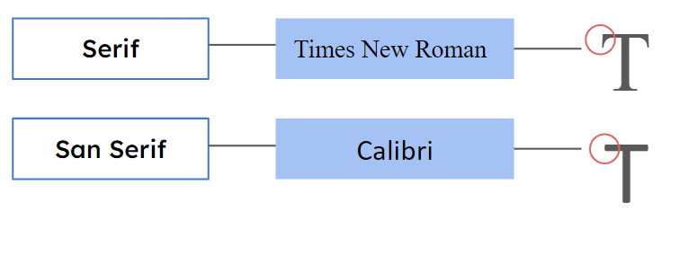
Feature | Serif Font | Sans Serif Font |
Appearance | Classic, formal, with decorative strokes | Modern, clean, with uniform strokes |
Readability | It is easier to read in print, especially for long texts | Better for digital screens and short texts |
Emotional Tone | Conveys tradition and reliability | Conveys modernity and simplicity |
Common Usage | Books, newspapers, and formal documents | Websites, apps, and logos |
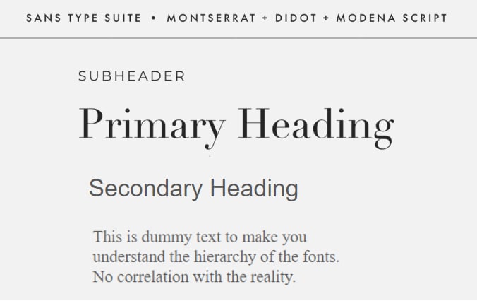
2. Hierarchy:
Text formatting to prioritize, that is the strategic placement of numbers, letters or words in order to control the viewers focus. This is a crucial component of typography design because it affects the way the reader interacts with and understands the layout.
3. Alignment:
It enhances the general aesthetics of design, guides the reader’s eye, and facilitates readability. For instance writing tend to be aligned to the left to ease reading while text aligned to the center is more formal for invitations and titles. These he found relate to the clarity and the tone of the design, where a certain degree of alignment decisions prevail.
4. Spacing:
The following aspects of Typography design are related to spacing which we would understand with the example shared :The following aspects of Typography are related to spacing which we would understand with the example shared :
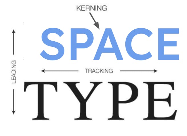
4a. Leading: It is usually the space that lies between two lines of a text body.
4b. Kerning: The distance that exists between two individual character in a word.
4c. Tracking: It is the spacing of every letter in a single word or in the entire passage for a particular text.
5. Contrast:
In Typography design, contrast enhances readability as well as adds elements of aesthetic appeal to texts. It involves the use of contrasting features referring to headings and the actual body text in form of typeface, size, weight and color.

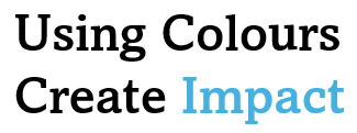
6. Color:
Typography needs color to increase reading and add visual interest. It means utilizing different complementary colors to distinguish parts such as headings and body text. A text with good color theme is easier to read, helps the reader concentrate, and draws attention to key points.
7. Legibility and Readability:
7a. Legibility is the ability to discern particular letters or characters from one another easily. It depends on things like font selection, size, and spacing. High readability is required for writing that needs to be rapidly and adequately recognized, such as headlines, logos, and signage, where instantaneous clarity is critical.
7b. Readability is the level of understanding a reader can manage to go through a particular text passage without difficulty. It depends with the general layouting which factors include line length, line spacing and the size of the font. A high level of readability is especially critical with more significant works, for example, books and journals where the way information is written must help the reader to follow it easily.

You may also check: Color Theory, Color Wheel for Designers
Applications of Photography - Advance Photography Techniques
Indian Traditional Painting Styles
Art Movements: History, Types, List of Art Movements
Typography for Good Design
Good typography is essential because it helps to produce better communication great and clear-looking materials. It can guarantee that the message has been passed in the right manner, control the flow of attention and elicit the most appropriate emotions. Typography is considered to be an important field for a design aspirant because it is the base of every type of visual communication. When designing logos, websites, or any other print media, the professional must effectively balance the use of good typefaces, thus making the designs more effective to the Target group.
In such examinations as NID and UCEED, typography distinguishes one’s work to the other and this is where a candidate can triumph forever with good typography. It would also show details, creativeness and a good understanding of type that affects designing.
Diverse Applications of Typography
1. Web Design:
Typography helps to increase website usability and branding as it controls the flow of users’ interactions and ensures the overall consistency of a visual design.
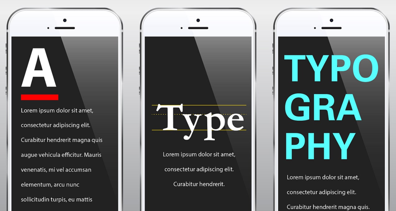
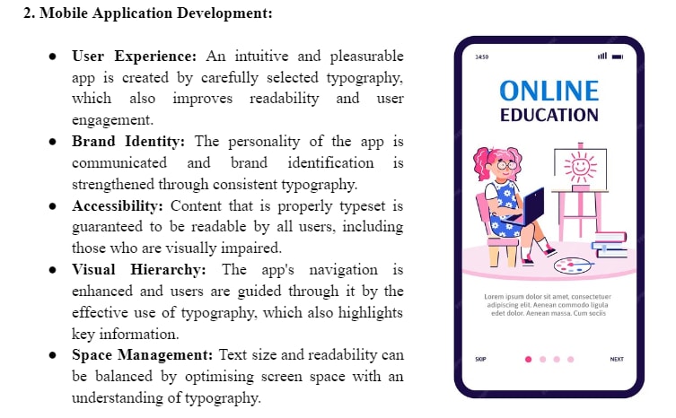
2. Mobile Application Development:
3. Print Design:
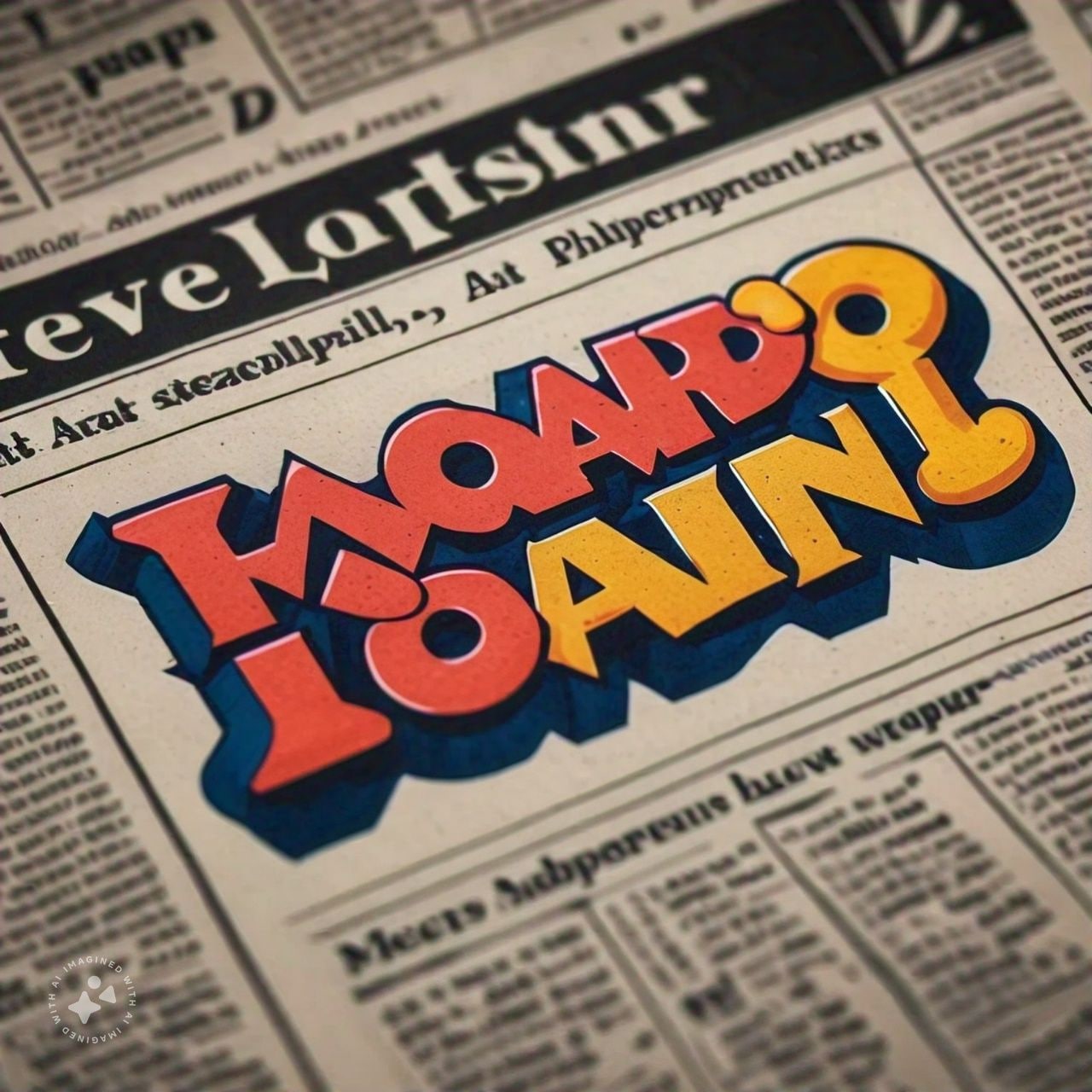
Excellent reading flow and aesthetics are critical in design such as editorial and packaging and thus the need for Typography in print.
4. Branding and Identity:
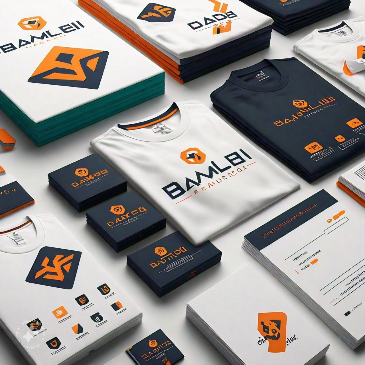
Typography identifies the brand tone and gives cohesiveness to logos, Marshall's and commercial graphics.
5. User Interface (UI) Design:
Typography labels are used to make the interactive elements and structure the information clearly and easily.
6. Motion Graphics:
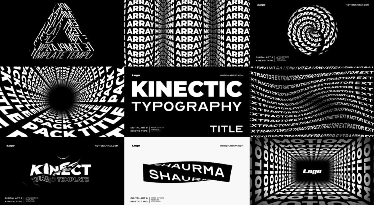
The use of Typography gives life to the content that is put in a video and determines the mood in the title sequences.
7. Environmental and Spatial Design:
Graphic design in signs and exhibition makes it easier to provide ways of getting around as well as making physical spaces more interesting.
Important Sample Questions from NID/UCEED
Q1. Which option has the same visual grammar of the letters on the left?
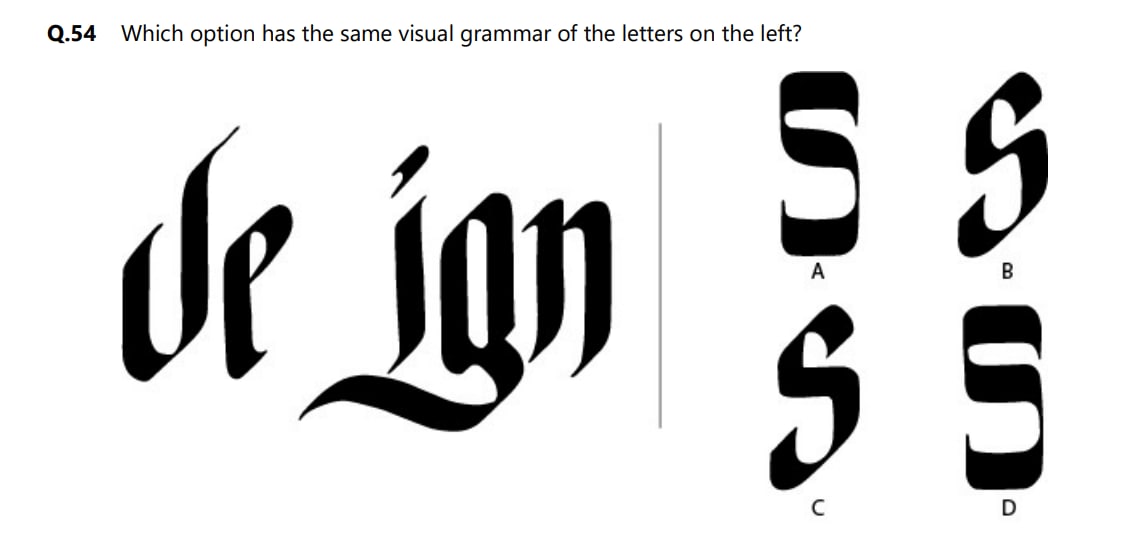
*Approach - Notice the stroke and line weight at the middle and ends.
Sample Questions and Answers:
Q1: Why is typography important in design?
A: Typography improves readability, enhances visual appeal, and communicates brand identity effectively.
Q2: Which font is best for digital content?
A: Sans-Serif fonts like Arial and Roboto are ideal for digital screens due to their readability.
Q3: Why are serif fonts used in print media?
A: Serif fonts improve legibility in long texts and help guide the reader’s eye across lines.
Conclusion
Typography is a powerful design element that impacts how users interact with written content. By understanding its elements, classifications, and applications, designers can create visually appealing, clear, and effective communication in both digital and print media.
Frequently Asked Questions (FAQs)
Typography means the application of arts and techniques in arranging type for enhanced aesthetic and readability values of textual information.
The Typography component helps maintain a consistent design by providing a limited set of values to choose from and convenient props for building common designs faster.
The five types of typography are serif, sans serif, script, monospaced, and display.
Firstly, through the use of appropriate typeface the overall mood of your design and its readability are complemented while being an important vehicle for the conveyance of your particular message.
Get familiar with how fonts look like and work through testing various fonts, observing how typography works in the current designs and recognize how hierarchy, space and alignment can be implemented to enhance the quality of designs done.
Font is important in these exams since it is evident that good designs enable you to pass them; the designs give nice layouts, they are professional and creative in passing on ideas out of the box.
Typography plays an important part in the process because it determines the ways people interact with information. It makes the task of reading easier, controls the direction of the viewer’s sight and sets up the mood of a design. Typography helps to improve the usability of content and thus makes this or that material more enjoyable for a viewer. The basic knowledge of typography is crucial in the print and graphic design fields.